Top Email Marketing Examples of 2018
When it comes to email marketing best practices, you could say the SendGrid marketing team is a rather opinionated bunch. And although we’re happy to talk about email marketing best practices, we wanted to let some of SendGrid’s favorite brands do (most) of the talking for this guide.
The hand-picked email marketing examples below illustrate some of the best things happening in email right now. The list covers all aspects of email best practices, including personalization, testing, subject lines, and more. Learn how you can take their ideas and execute them in your email marketing program.
1. The Hustle
Topic: Subject lines, A/B testing
The Hustle is a daily email newsletter that curates some of the day’s most important headlines in business, tech, and culture. They send a healthy dose of news that I don’t necessarily get reading the BBC that keeps me opening every day.
The Hustle constantly tests subject lines, which always tie back to their first story of the day, and are often creative and funny. Take the example I’m using from March 5th—their first story was about new technology trying to bring Internet access to remote areas using satellites.
A: Clear, Relatively Safe


B: Creative, Funny


Why it works:
- Both versions describe (albeit in very different approaches) what’s inside the email in an intriguing way.
- Both versions provide succinct subject lines of 5 words or less.
- By testing a relatively safe version against a more “out there version,” they were likely to tell which one resonated the most with their unique readership.
- The Hustle has a complete handle on their brand voice and this allows them to talk about cat videos and still be taken seriously (and get those opens!).
“Their tone is casual, and their writing is witty without dumbing down the content.”
2. Airbnb
Topic: Personalization
Airbnb is an online marketplace for short-term lodging and vacation rentals. Airbnb acts as the broker throughout the transactions and provides this connection between for a fee. Self-described as " A Community Built on Trust," they have built up a strong reputation which supports that.
The following email I received from Airbnb stood out to me as a great email example for various reasons, but right off the bat, what stood out to me was the use of personalization.


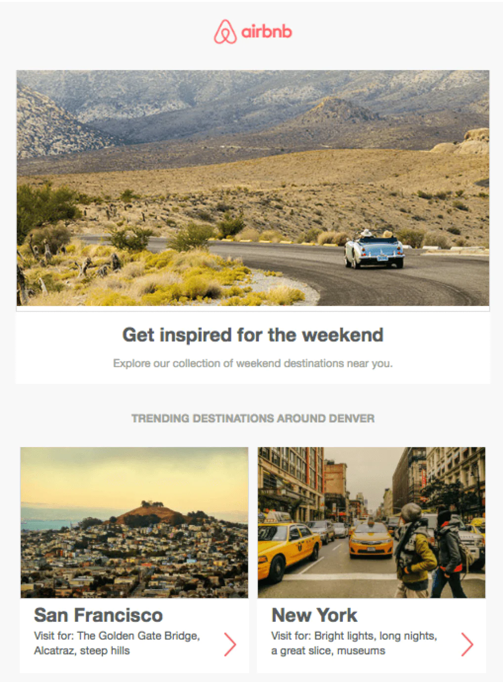

- Clear promise to provide inspiration
- Simple use of data to provide personalized experience
Why it works:
- The personalization starts with the subject line, and they used not one, but two pieces of personalization with basic substitution tags (my name and home city).
- By knowing that the email contains personalized information, curiosity naturally increases and will increase the chance of an open.
- This email campaign leverages and makes the most out of the data that the company sits on to provide useful insight for me—where other Denverites are booking vacations.
“This email does a great job of using data in a simple and logical way to create a personalized experience.”
3. Medium
TOPICS: PERSONALIZATION, COPY & CONTENT
Medium(.com) is an online publishing platform featuring articles ranging from personal finance, to sports, to humor, and much, much more. It also serves as a blog hosting service, allowing users to create accounts featuring content of their own. Rather than focusing on unique visitors to their website, the company optimizes its business around time spent reading the site; a testament to the quality of the content provided.
Medium’s “Daily Digest” is a top email example because of the excellent personalization behind their email. (Disclaimer: I don’t work for Medium, so the following contains assumptions about the inner-workings of their personalization!)
Upon signing up for a free account, your first task is to select subject matter that most interests you. Those interests are then plugged into their magical personalization engine, which goes towards generating your “Daily Digest” email.
As your consumption of Medium content continues, the personalization in the digest sharpens, making it the epitome of my “wanted mail” every morning.
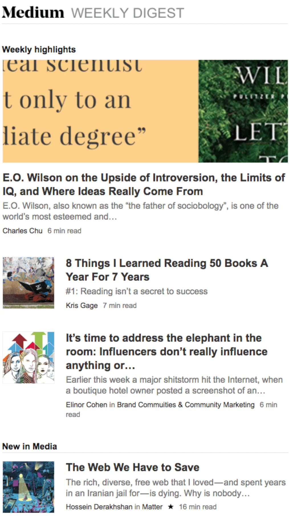

- Digest is personalized based on user’s selections
- Featured article matches subject line of email
- “Read time” sets expectations
- Author recognition gives a personal feel
- Categorization makes it easy to scan
Why it works:
- Featured article: Each digest features one story at the top, which is also included in the subject line of the email.
- Read time: Before choosing to click on an article, recipients are given a heads up with an “X min read” warning (The Full Send also does this!).
- Categorization: If I’m not in the personal finance mood today, I can continue to scroll down to another category that better aligns with my current mood.
“What better way to engage with recipients than by giving them all of the content they explicitly asked for?”
4. Bookit
TOPICS: PERSONALIZATION, SUBJECT LINES, A/B TESTING, DESIGN
I’ve used the travel company Bookit.com to book multiple vacations to Cancun. Since those trips, I routinely find emails on current deals at resorts throughout Mexico and various Caribbean destinations in my inbox.
I often find myself perusing their deals and desperately fighting the urge to plan another impulse vacation. “What? An all-inclusive resort in Cancun for less than $100 per night? Tell me more.”
Take this recent email’s subject line that provides a time-based incentive, along with a low-friction commitment:


Once I opened the email I see a beautiful beach photo, but what stands out to me is the branded search box at the top. Even though you are not able to enter your destination, check in and check out dates, the email is branded the same as on the website:
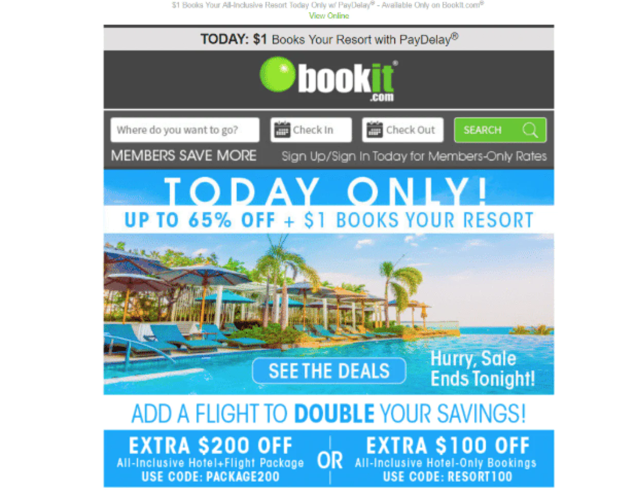

- Branded search bar creates consistency with site
- Beautiful, attention-grabbing image
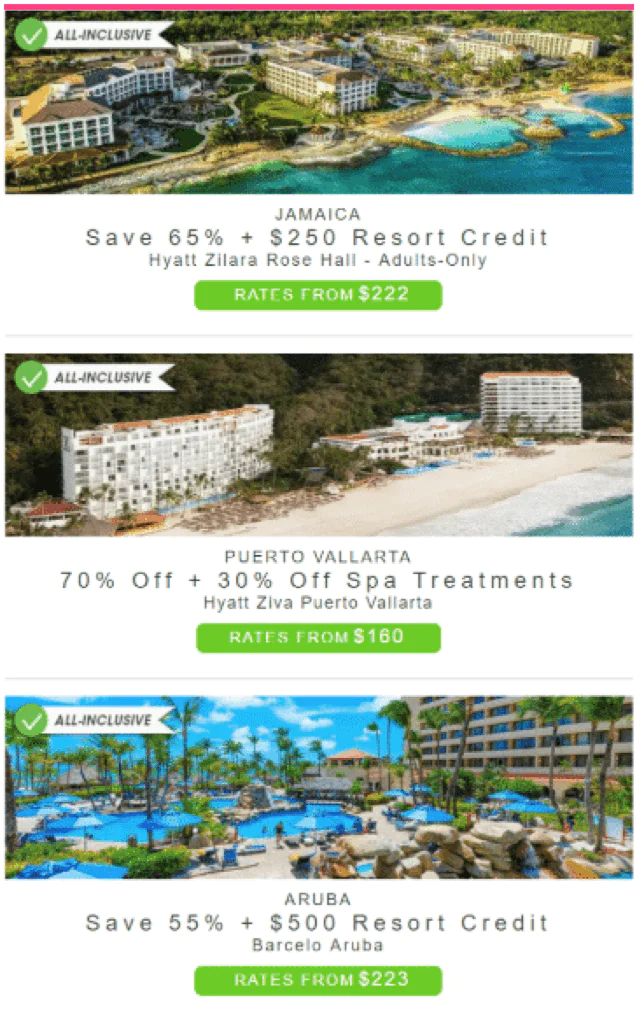
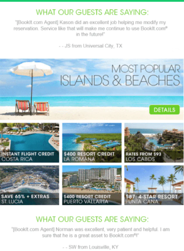
It becomes apparent that Bookit is also testing various templates and elements in their email campaigns. In one variation, they are testing the impact that larger pictures have on CTRs (click-thru-rates). In the other, they are testing the concept of “social proof” through customer quotes:
A: Large Images

B: Social Proof

Why it works:
- Segmentation: Bookit is using data to provide personalized recommendations and knows that there is likely still interest in these locations for future trips. Because I’ve booked Mexico trips in the past, I was likely added to this destination email segment and this email campaign serves as a retargeting campaign.
- Subject lines: by presenting a time-based offer with some urgency, this email comes across more timely and one that needs to be opened soon.
- The emails maintain consistent design across multiple experiences, and subtly implies what the desired CTA (call-to-action) will be on the website.
- A|B testing in your emails, not unlike website pages, is an essential part of understanding what truly resonates with your customers and can drastically improve conversion rates.
“Now if you’ll excuse me, there is a tropical resort I need to look into.”
5. Yelp
TOPIC: DESIGN, COPY, PERSONALIZATION
There are two things that almost always catch my attention: creative, witty alliteration and savory, delectable desserts. Yelp, a leading customer review site, managed to incorporate both in one of the many themed newsletters they recently sent me.
Yelp’s weekly newsletter titled, “Bangin’ Beignets!” tempted, and ultimately, persuaded me to try the powdered sugar delights at a few of my local restaurants.
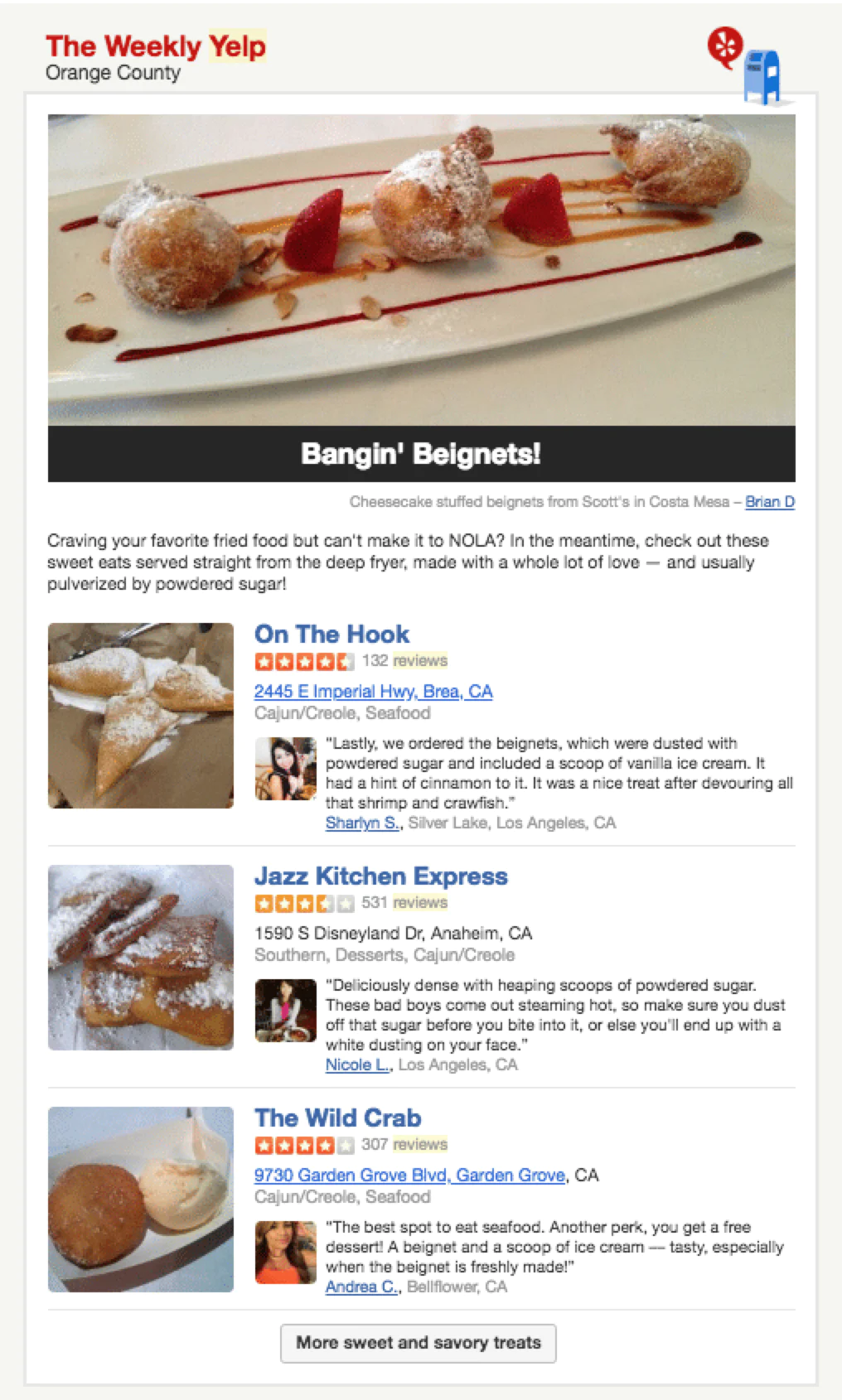

- Strong image to grab attention
- Witty alliteration in headline
- Helpful content with social proof
- Appropriate text-to-image ratio
Why it works:
- Personalized content that is based on location provides a tempting offer.
- Well-balanced image to text ratio. The newsletter depicts a delicious assortment of beignets to catch the reader's attention followed by concise and creative copy that is straight to the point.
- Creative, witty, and effective copy to introduce the featured restaurants.
“Don’t get too carried away with images, because it may raise a red flag to spam filters if you haven’t provided enough text.”
6. Birchbox
TOPICS: BRANDING & DESIGN, COPY & CONTENT, PERSONALIZATION
This example of stellar email design comes from one of my guilty pleasures, Birchbox, a service that sends personalized beauty product samples to your door every month. This email is telling me about options to customize my April box by choosing some specific samples—and giving me a little shopping break in the middle of my day!
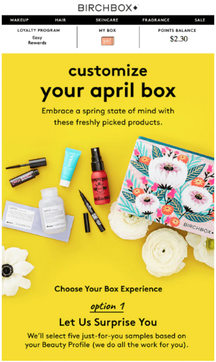

- Valuable account info
- Bold, limited text
- Bright colors and relevant, beautiful imagery
- Content broken up into clear sections
Why it works:
- Bright colors and bold font: the yellow is very eye-catching, and the limited use of text makes the email very skimmable.
- Hierarchy and readability: They broke up the content into 3 main sections that clearly show what the email is trying to accomplish (getting me to choose the way I want to customize the box). Despite needing to scroll a little, I can interpret the goal of the email instantly.
- Valuable content: There is also a ton of valuable intel given right in the email, from photos of the actual samples to my loyalty program level, and my point balance.
- Personalization: By using substitution tags in the header and subject line, as well as providing a customized call to action, they’ve personalized my experience and made it simple for me to take action.
“Everything about this email is eye-catching and engaging. Plus, I got to shop!”
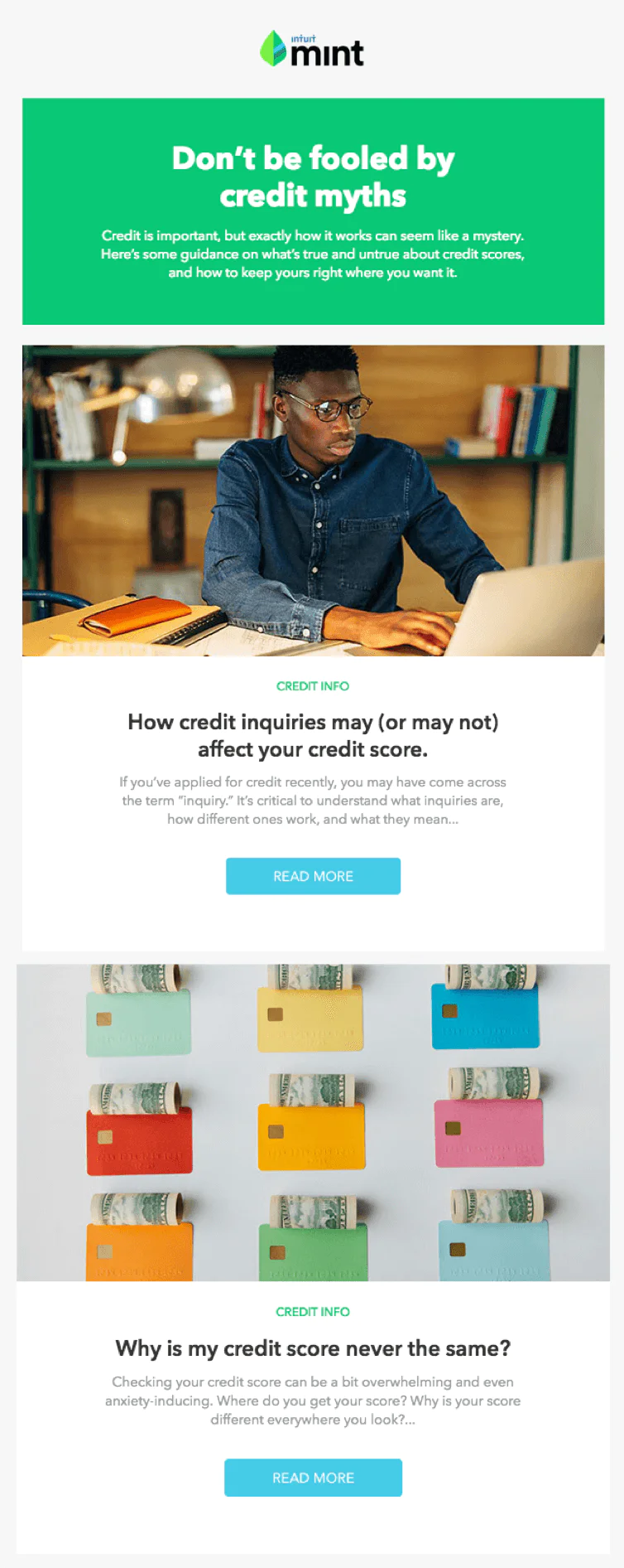

- Headline that catches your eye
- Clean, simple design
- Useful educational content
Why it works:
- A headline that catches your eye. Let’s face it: credit can be a scary topic. The headline of this email gives a reader pause (“Am I being fooled by credit myths? How much do I really know about my credit?”), encouraging them to continue to the content below.
- A clean, simple design that doesn’t overwhelm you. Pops of colors and high-quality images are on-brand and reflect the simplicity of the Mint platform. And by using SendGrid Marketing Campaigns, the Mint team can quickly add and fine-tune pictures, buttons, and more to achieve their email vision.
- A place to provide feedback on the content of the email (not pictured). Including a preference center where recipients can update their information or unsubscribe from emails is critical for ensuring you’re only sending wanted mail. Mint takes this a step farther with a link to a simple, anonymous form for readers to explain why or why not they found this email useful—what a great way to source feedback and learn from your recipient base!
“I love this email because it unselfishly delivers value and reminds the reader of why they created a Mint account in the first place.”
8. Autopilot
TOPICS: SUBJECT LINES, COPY & CONTENT
Time is a precious commodity. But what’s an email marketer to do about recipients who say they want their communication (by expressly opting in) but then go dark?
Hit them with a re-engagement email! Autopilot produces killer content, and I initially signed up for their email anticipating that I would devour every asset they sent my way...but, apparently, it’s been a while since I opened or clicked. (My bad, Autopilot! Hope we’re still cool.)
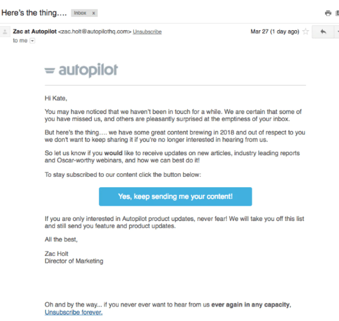

- Mysterious subject line
- Personalization in “from” name, body of email, and signature
- Clear list of what content to expect
Why it works:
- Mysterious subject line: Using a cliffhanger subject line that leaves the recipient wondering/wanting something more is a great way to encourage and increase opens. But it’s a tactic that needs to be used sparingly—I’d recommend saving it for an important 10% of your messages. You don’t want to earn a reputation for using clickbait!
- Personal approach: This email technically is HTML (note the big blue button with the CTA), but it has an overall plain text look and feel. Because it addresses me by name, is a similar font to what I would see from a friend that’s writing me an email, and closes with the sender’s name and title (that also matched the from address), it makes the overall recipient experience feel more like a 1:1 conversation.
- What’s in it for me? This re-engagement email outlines what people will continue to receive by re-opting in to receive their mail—new articles, industry leading reports, and Oscar-worthy webinars. Seems like a no-brainer, but it’s often overlooked content! Remind those subscribers what hooked them in the first place and get them excited to start engaging again.
“They put thought into the recipients’ experience and crafted the message with the end goal in mind—to get their sleepy subscribers to wake up or get off their list.”
9. Artifact Uprising
TOPICS: BRANDING & DESIGN, COPY & CONTENT
Artifact Uprising is a premium quality, custom photo print company that is very intentional about every aspect of their business, from the initial photo capture to the materials they use for printing. Their marketing emails don’t falter in intention either, as their style is a condensed replication of their site.


- Design consistent with the brand and website
- Clear CTA for those ready to convert
- Second CTA directs the reader’s eye downward
- Concise, digestible copy
- Final CTA for those hooked by the first four tips
Why it works:
- Consistent branding: Artifact Uprising’s design style is so tranquil that it screams their name. Ironic, huh? Successful branding doesn’t always require a big, bold logo. The fonts and imagery in the body of the email are pulled directly from the guide they’re promoting, which creates a seamless experience for the user as they click through. I find this important because there is absolutely no deception about what you’re getting once you arrive at the actual guide.
- Descriptive copy that acts as a hook: I appreciate descriptive copy that accentuates design and style, without overshadowing it, and since Artifact Uprising is a photography-focused company, it makes total sense that they’d design this way. Each section of copy complements each photo with concise, digestible tips. The clever part here is that the promoted guide is titled “6 Tips to Photograph Spring,” yet the email only provides two tips, leaving the reader hungry for the final four.
- Well-placed CTAs: Three very different, yet obvious clear calls-to-action are sprinkled throughout the email copy. The most obvious, “Get The Guide,” is at the top (likely for those who don’t need any additional coaxing to their site). The following, “Start Here,” is a great way to keep eyes navigating down the email. The final is at the end of the content, as a final closer. All three CTAs are positioned as actionable buttons, but they’re subtle; not pushy or repetitive.
“Successful branding doesn’t always require a big, bold logo.”
Email best practice takeaways
Many elements go into creating a knockout email marketing campaign. But don’t let that overwhelm you. Focus on providing simple and friction-free experiences for your recipients and tailor your ideas, experiments, and optimizations around this single notion.
If you’re starting out with email marketing, consider focusing on one element such as design, testing, or copy and add a focus area with each campaign.
And if you’re already creating emails, but are looking for ways to improve, start trying to get more in depth with additional testing strategies or enhanced branding and design.
When in doubt, take another look through the examples above for new ideas to try in your email campaigns.
