Keeping a brand experience consistent across all marketing touch points is a crucial component of cultivating an engaged user base. And one of the more important transitions a customer or prospect makes is from an email to a website.
This responsibility lies primarily on how you design and build your email campaigns. The less aligned your emails look from your website (and your overall brand), the more likely you are to confuse and cause friction with your recipients. The following email design tips will help unite your emails and website to ensure that your recipients don’t become distracted by inconsistent branding.
Note: These tips are also illustrated with real-world examples by a SendGrid customer Wine Exchange (Winex), who just recently updated their email templates to achieve that cohesive feel between their emails and website. And all of these tips were completely executed in SendGrid’s new editing experience.
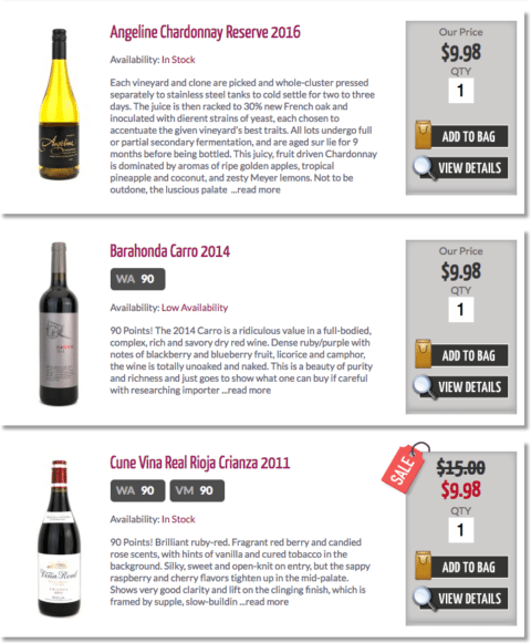
Start with the larger foundational design elements of your website, such as column layout, when you start to lay out your email templates. But, just because you might have a three column break on your website doesn't mean you must have the same in your email designs. Again, the goal is to keep the idea and feel the same.
Here is the column layout on Winex's website:

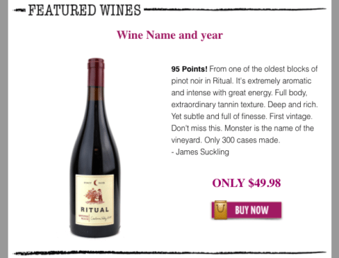
And here they are in their email campaigns:

Notice that they altered their layout slightly to two columns, but it still presents their product in a consistent way.
An often overlooked element of the email template is the footer. Making the email footer match the website footer is a great way to connect your website and emails so that the user knows how to navigate to certain parts of the website.
Keep in mind that when you are laying out your email campaigns, you don’t have to exactly copy your website, but as long as the overall look of your website transfers over to the emails, you are well on your way to keeping your brand experience consistent.
Imagery is a powerful design component and tool that can bring emails to life and increase recipient engagement. But images in emails (along with other digital mediums) can become problematic, quickly. Every inbox handles and renders images differently and the more images you include, the slower your email will load. Some ISPs may even view your emails unfavorably and place your email in the spam folder if there are too many images.
Before their email redesign, Winex’s newsletter consisted of several non-responsive images. This not only confused the recipient, it likely caused some annoyance and reduced engagement. Their new email design actually includes fewer images, but they’re responsive and don’t interfere with the user’s interaction with the content. Winex was able to make all images responsive easily by using
SendGrid's Marketing Campaigns editor.
Keep in mind that some inboxes won’t even display images, so the more you rely on the images to communicate your messages, the more likely that you risk your entire email.
Images supplement, they don’t carry your email program.
And don’t forget to browser test your emails to ensure that the majority of browser and device combinations are displaying your emails the way you want them to.
Buttons and CTAs within your email should also be as similar as possible to your brand’s website so that the user knows exactly where to go if they want to learn more or continue their experience. In Winex’s case, they imported the buttons directly from their website into the email templates. The top row of buttons is pulled directly from their website, and the bottom are the buttons within their email campaigns:


These buttons and CTAs are consistent and clear for the user whether they are on the website or reading an email. For more on how to perfect your CTAs download a copy of
Build A Strong Call To Action Guide.
The font you choose for your emails should resemble the font found on your website as much as possible. If you want the exact font from your website, this advanced option is made simple using
Marketing Campaigns' design editor’s option to edit the HTML Head to add custom fonts. However, this is by no means a “must do” for email design.
Because some fonts aren't always supported, you should always use fallback fonts (similar looking and supported fonts readily on hand). Havind these fonts on hand will help you quickly be able to create your email campaigns. As long as you compare the fonts side by side, you will be able to find a good match. In Winex’s final design, they ended up using the font Arial which tends to read well universally.
Although your emails don’t have to match your website brand exactly, ensuring a consistent brand experience from an email to a website and vice versa is key to keeping your recipients and customers engaged. Keep in mind the following guidelines when designing and putting together marketing emails:
- The overall layout does not need to match 100%, but should convey the same design ideas
- Ensure you are using responsive images, and that you are browser testing before sending
- Fonts do not have to be a perfect match—most ESPs provide enough web fonts to match your website enough without having to import from your website
Learn some more specific tactics on email design by checking out our blog post,
Design Email Best Practices To Boost Engagement. And explore
SendGrid’s new editing experience here to see how it can help you keep your brand consistent across channels.


