How to Customize an Email Marketing Template


May 21, 2023
Written by
Julie Griffin
Contributor
Opinions expressed by Twilio contributors are their own

How to Customize an Email Marketing Template

Today, we’re diving into templates and how to use them with Twilio SendGrid’s flexible editor or adjust the HTML of the template in your email builder of choice. While some marketers may feel comfortable designing and coding a beautiful email from scratch, for those of us who aren’t web designers or email developers, email templates provide a powerful, time-saving way to craft beautifully responsive emails.

In this post, I’ll walk you through how to choose a pre-built email template and the design choices I make along the way.

Choosing an email marketing template


If you’re starting in Marketing Campaigns, you have a variety of template options. But before you choose a template, ask yourself:

What is the purpose of the email you plan to send and the action you want your recipients to take?

Does this action require an explanation with a lot of text and a CTA, or are you trying to visually display your products with multiple images? Keep an eye out for structure and a format that will work well with your content.

Is your brand bold and loud, classy and quaint, modern and sleek? It's helpful to find a template that resembles your brand. While you can change images, text, and colors to match your brand, it helps to have a template that aligns with the style you’re looking to achieve. 

I chose the Ingrid and Anders Welcome Series 2 template on the left (available to download here) because I plan to send a promotional email from a jewelry store.

While the colors and images don’t represent the jewelry store’s brand, the boutique look fits the overall feel of the brand and the multiple images and sections of copy work well for the content I plan to send.

Customizing for your brand 

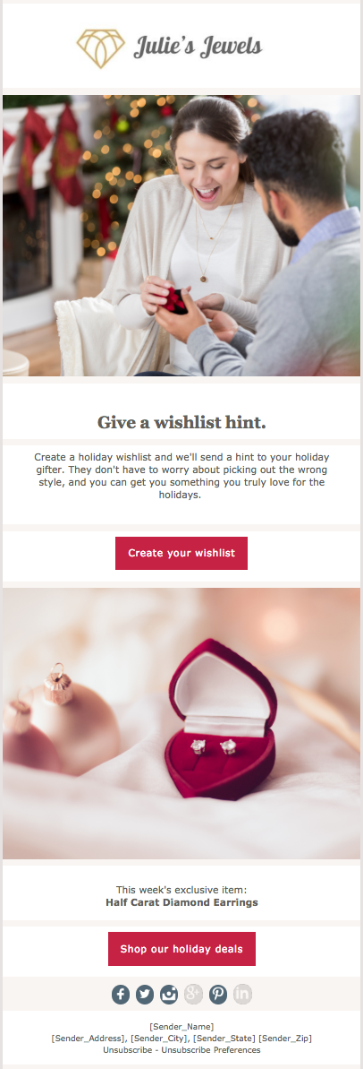
Here’s my step-by-step approach for getting from the template above to the email preview on the right while keeping the brand, message, and desired action in mind along the way.

Step 1: Header

I started by placing the jewelry store’s logo in the header. Your email recipients have shown that they trust and are interested in a relationship with your brand. Ensuring that what they see when they open your email is familiar and expected is critical to maintaining that trust.
    • Width: The width of the header needs to be at least 600 pixels so that it stretches the full width of the email.
    • Alignment: Most companies either align their header to the left or center it.
    • HTML: To change the logo in HTML, swap the link in the img class attribute. The link should be placed in the src attribute (see below). Don’t forget to include the quotation marks around the link.

Step 2: Images

Choose images that relate to the copy and your brand. Jewelry is such a visual product, so I wanted the images to take up much more of the email than the copy.

The first image in my email relates to the copy and receiving a holiday gift. Images that feature people help recipients emotionally connect with the content. The second image highlights a special jewelry offering to help drive visitors to the website. I found these images on iStock, but there are many other resources for finding great images.  

When including images in your email remember to: 
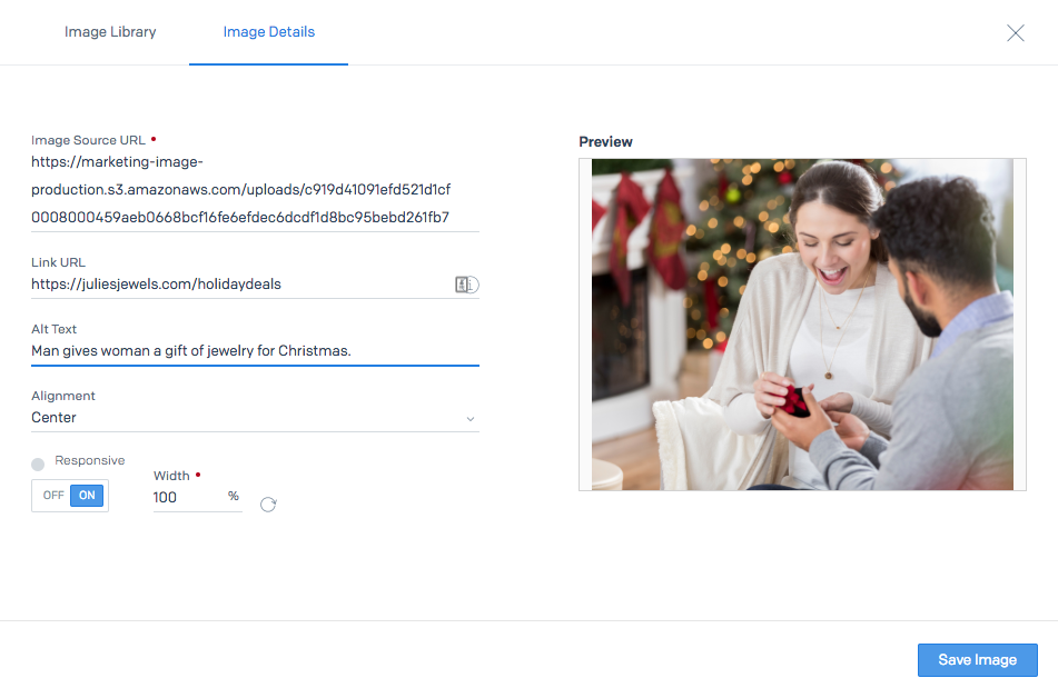
  • Include alt text:  Some ESPs hide images in emails. Including alt text helps recipients understand the idea behind the image even if they can’t see it.
  • Link images: We expect everything to be clickable, including images. In this email, the picture of the diamond earrings, especially, needs to be clickable to the description of this product on the website.
  • Image size: Just like the header, make sure the width of the images is at least 600 pixels.  
  • HTML: Similar to your logo image, look for the img class and src attribute when switching out the images in the template. To include alt text, add the alt attribute to the img class and describe your image. To add a link to your image, include the href attribute within the img class tag.
Step 3: Font

Marketing Campaigns allows users to import fonts so that you don’t have to sacrifice brand standards in your emails. You can add in your font by editing the HTML head (found under “Advanced” in the left navigation). Here are the step-by-step instructions on adding a font.

Some ESPs only support a handful of fonts, so it’s a good idea to choose a standard default font such as Arial, Times New Roman, or Verdana. Pick one that matches your website as closely as possible. This way if your brand’s font isn’t supported, you’ll have a backup ready to go.

Step 4: Copy

For this newsletter, my goal is to get the recipient to the website either to create a wishlist or to shop, so I don’t want them staying in the email too long. This is why my copy is short and to the point, leading directly to the call-to-action buttons.
  • When writing your email, circle back to the goal of your message, and ask yourself, what action do you want your recipients to take?

Step 5: Colors

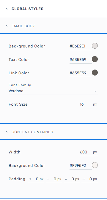
Align your emails to your brand by using similar colors to your website. Your emails don’t need to look exactly like your website, but try pulling in at least one or two colors into your email to tie in your brand. For this email, I changed the font color to be the same as the website and included images that have a hint of gold to match the logo.
    • Email background: If you peruse your inbox, you’ll notice that most of the emails have a white or neutral background color, and, occasionally, black. We recommend sticking to one of those colors for the backdrop of your email. Bright or bold colors can feel overwhelming and distract your recipients from the actual content of the email. To the right, are the colors I used for this email's background and text. 
    • Footer: A great way to align your email with your brand is to use the same footer background color and font color as your website. This helps create continuity between your emails and your website.
    • CTA Buttons: These buttons are often the brightest and boldest element of your email. They should grab attention and motivate a recipient to take action.
    • HTML: To change the color of backgrounds, borders, or fonts in HTML, look for the 6-digit, Hex color. You’ll find the hex code in elements and attributes like style, span stylebackground-color, bgcolor, color, and border-color. It’s likely that your template will have multiple attributes for the same color to be able to communicate the color to all email providers. Be sure to change all sections that list the color. Check out this example of the CTA button design and code. 


Step 6: Test!

Once you have your email set up, test it by sending a preview to yourself. Here are a few things to check in your preview:
  • Is it mobile responsive? Review your email on your desktop and phone to double check that the email is mobile responsive.
  • Do all the links work? Click through all the links and linked images. Check that the CTA buttons are big enough to click with your finger.
  • Is your brand recognizable? Compare your email and your website side-by-side. Your brand should shine through in your email.
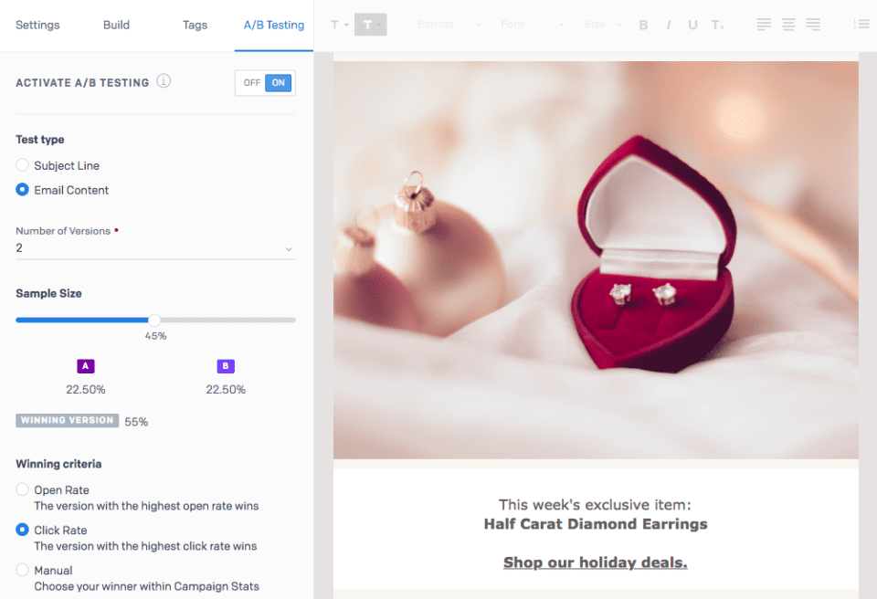
In Marketing Campaigns, you can also A/B test different elements (see image below), and see if a plain text link helps engage more clicks than a colorful CTA button. This will give you data to back up your design choices for future sends. For a full list of items to review before sending your email, look through Your Pre-send Email Testing Checklist.


Prebuilt templates are a great time-saving solution for those of us who aren’t email design and development experts. It’s easy to customize these templates to reflect your company’s brand and message without needing to get into the weeds of the email HTML.

For dozens of customizable, responsive templates sign up for a free Marketing Campaigns account.

Recommended For You


Most Popular


Send With Confidence

Partner with the email service trusted by developers and marketers for time-savings, scalability, and delivery expertise.