 Part 1: Email Newsletter Conception and Design
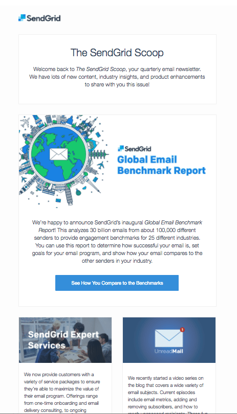
Welcome to “Behind the Scoop,” a 4-part series that takes you behind the scenes of SendGrid’s very own customer-facing quarterly email newsletter, The SendGrid Scoop. I sat down with our in-house Engagement Marketing Manager, Jill Guest, to glean some of her insight and expertise from managing and deploying “The Scoop.”
In part one, we cover newsletter conception and design tips the team uses. Before we dive into topics such as design, content selection, and measurement, read about why the SendGrid Scoop came to existence and the pain points it addresses.
The Scoop came to be when the team realized that although there was regular communication between customers who were onboarding, there was no regular ongoing conversation for current customers. The team decided to put together a newsletter for those customers that included:
- Industry news and trends
- Product updates
- Content resources such as blogs and best practices guides
The team agreed that the newsletter would not be promotional in nature, but instead, would provide informational advice and resources. Additionally, the team felt it was part of their obligation to customers to keep them educated on the changing email landscape so they could be the most successful senders possible.
And how often would the team send out The Scoop? Jill said that the nurture team agreed that they wanted to be very conscience of recipients’ time and that a quarterly cadence would provide enough touch points to keep readers engaged.
Now that the team finalized the goals and cadence, it was time to design a clean, modern, and engaging email template. For those who are newer to email marketing, the design elements may be one of the most daunting aspects of creating email newsletters. Fortunately, ESPs such as SendGrid provide easy to use design tools so you don’t need to have an email developer or code HTML within the email if you don’t want to.
Jill works with an in-house design and development team and sends The Scoop through SendGrid’s
Marketing Campaigns tool. New customers who may not have access to these resources can still create a beautiful template with SendGrid’s drag & drop editor or by starting with one of our provided templates and customizing it with their colors, copy, and imagery.
Ready to start designing? Follow Jill’s tips and recommendations below to nail your email template design:
 Use a modular template
Jill and her team work off of a master template that’s adaptable from issue to issue. Working off modular
templates does not require a set minimum or maximum number of stories for each issue. This flexibility doesn’t lock you into a certain number of stories each issue while still allowing you to have g design consistency.
If you’re newer to email marketing or don’t have the resources to HTML code designs or if you just want the flexibility of changing your templates quickly, the modular template may make the most sense. SendGrid customers can find even more templates in their account under “Marketing Campaigns” > “templates.”
Reinforce your brand with your design. This is especially important in your header image, but also throughout the body of the email and into your footer. The Scoop achieves this simply by including the logo at the header and footer. Your recipients should immediately recognize who the email is from and what they can expect inside that email.
Imagery is a powerful tool for marketers, but Jill warns to not let the images completely take over your email designs. A good guideline for image density is 20-30% of your entire email although you should be testing this as it can vary on your business, recipient list, and content.
Designing mobile responsive eail templates are
extra crucial when sending email newsletters. SendGrid’s Marketing Campaigns allow you to view how your email will appear on a mobile device so you can be sure that it will display correctly before you send.
Jill suggests consistently testing elements of your design to help you make informed decisions about future designs. Elements that work well for testing include:
- Image placement and frequency
- CTA placement and style
- Single or multiple column layouts
The tips above will get you started on the right path when creating an email newsletter and designing its template. Learn more about email marketing from Jill in SendGrid’s
Expert’s Guide to Email Marketing. Stay tuned for Part 2 of "Behind the Scoop" which covers the content strategy and selection for The Scoop.
 Part 1: Email Newsletter Conception and Design
 Use a modular template