Send With Confidence
Partner with the email service trusted by developers and marketers for time-savings, scalability, and delivery expertise.


Time to read: 12 minutes
Squeeze pages are the key to building an engaging email list. No engaged list, no successful email marketing campaigns.
Below, I'm going to show you everything you need to know about squeeze pages to better build your email list.
This is your last chance. After this, there is no turning back.
I'm offering you the same invitation that Morpheus gave Neo in The Matrix.
You take the blue pill—you leave this page, you go back to browsing the same ol' same ol', and your digital marketing program stays the same.
You take the red pill—you stay in Wonderland, and I show you how to harness the true power of the squeeze page.
The choice is yours.
Squeeze pages are one of the best tools for helping you acquire the most lucrative piece of all personal data: the email address. Email marketing boasts the highest ROI (return on investment) of all marketing channels, with an average of $42 for every dollar invested.
But your email program is only as powerful as your email list—that's why squeeze pages are so critical. To build a kick-butt email list, you'll need high-converting squeeze pages that compel your customers to hand over their email addresses.
In this post, we're going to dive deep into the nitty-gritty details of squeeze pages. You'll finish as a squeeze page aficionado with the knowledge to create great (not just good) squeeze pages.
Think you know everything about squeeze pages? Or do you feel uncomfortably ignorant? Either way, test your know-how of squeeze pages with our quick quiz.
Score well, then you don't really need to read the rest of this blog post (byeee). Score not so well, then read on to uncover more about squeeze pages and how you can unlock their incredible value.
By this point, I'm assuming you took the red pill. Remember that all I am offering is the truth, nothing more.
Follow me.
A squeeze page is a landing page designed to squeeze a visitor's email address from them in exchange for something valuable.
Visitors opt-in by providing their email (and maybe their first name), and then you deliver the value. The value might be a newsletter subscription, free eBook, discount, cheatsheet, or other valuable lead magnet.
Squeeze pages work a lot like Morpheus's red pill, blue pill conversation with Neo in The Matrix. You're giving your visitors an ultimatum: (a) either enter your email address and receive the reward or (b) refuse to enter your email address and gain nothing but lose nothing.
The choice is theirs.
The only way to build an engaged email list is by getting your visitors to provide their email address and check the little box with their consent. And they're only going to do that if they get something in return.
No signup forms and squeeze pages, no engaged list. No engaged list, no successful email marketing campaigns.
Email success starts with your list, and your email list starts with compelling landing pages. See how it all comes together?

If you're thinking, "This whole squeeze page thing sounds a lot like a landing page," then you're on the right track.
A landing page is a standalone webpage created to prompt a conversion. That conversion could be to download an eBook, sign up for a free trial, contact a sales team, register for a webinar, etc.
A squeeze page is a specific kind of lead page. It's a landing page that's focused on one thing: collecting your visitor's name and email address.
So, all squeeze pages are landing pages, but not every landing page is a squeeze page. Make sense?
Oh, how deep the rabbit hole goes.
There are good squeeze pages, and then there are great squeeze pages.
Good squeeze pages are like bland samples at the grocery store—customers stop, take a bite, and keep on walking. But you don't want good—you want great!
Great squeeze pages are like the oh-so-delicious samples that draw a crowd—customers stop, take a bite, devour the rest of their treat, then buy a box. Now that's what we want!
For top-notch lead generation, follow these squeeze page best practices:
Answer the question: "What's in it for me?" Remember, an email address is the most valuable thing a visitor can give you (besides their credit card)—so trade them something irresistible: secrets, discounts, exclusives, etc.
Nobody will want to provide their email address if you're trying to trade raisins for M&Ms.
So, you're saying I need to give you my email address before I can view your infographic? Looks like I'll just go Google another infographic instead.
Ensure the offer fits the medium.
Yes, if you're sending your visitors an eBook, email course, or a downloadable template, an email address would be helpful. But if you're sending them a link to one of your YouTube videos, you don't need their email address.
What's the one single most important thing you want your visitor to do on your squeeze page? Give you their email address, right?
Reduce the number of form fields on your squeeze page and get hyper-focused with your CTA (call-to-action). The email address is non-negotiable, but do you really need your visitor's first name? What about their occupation, company, phone number, and name of firstborn child?
These extra fields distract from your request and add unnecessary friction to the sign-up process. Data shows that the more fields you use, the lower your conversion rate.
Keep your CTA short and sweet, and limit your form fields to 1-2.
Your website visitors are busy.
They don't want your free 100-hour digital marketing course (no matter how good it is). They want your quick and easy SEO cheatsheet.
Offer your visitors immediate value with little-to-no effort required on their part: email micro-courses, professional templates, tools, resources, calculators, apps, etc.
There's not a single-best way to create a high-converting squeeze page, but we recommend a couple of different options:
Landing page builders make it easy for you to use pre-made page templates or build your page design from scratch with drag-and-drop editors. But a nifty tool and a good-looking page design won't guarantee conversions—you'll still need to get strategic with the other elements.
No squeeze page is complete without a simple "thank you" autoresponder. Once a visitor enters their contact information, show your appreciation—they did just give you a priceless possession.
Now that we've discussed all the elements of an excellent squeeze page, let's look at some real-life squeeze page examples.
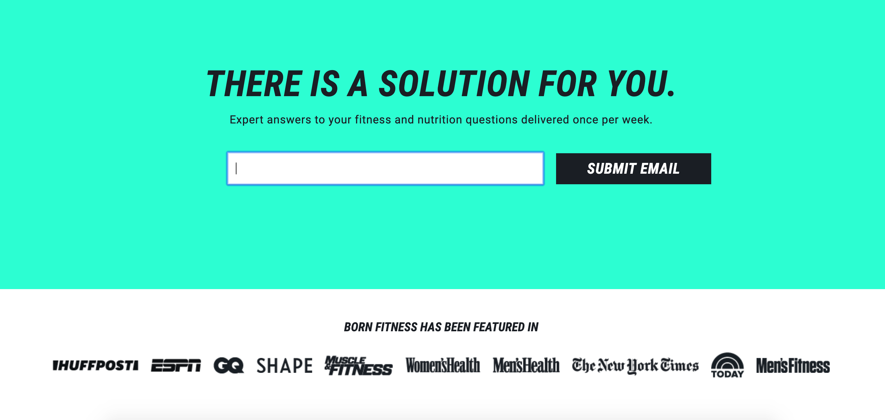
Above is a homepage squeeze page example from Born Fitness. It's a straightforward squeeze page that checks all the boxes: single form field, minimal copy, use of social proof, etc.
The value is simple: "Expert answers to your fitness and nutrition questions delivered once per week." To the visitor, this means hassle-free, reliable, and free—what more can you ask more?
In this example, the offer matches the medium. Yes, you need to provide your email address if you want to receive expert advice in your inbox every week. The offer also meets a delicate Goldilocks balance: not too much content, and not too little. Visitors might be hesitant to sign up to start receiving an email every single day—but once a week is just right.
This squeeze page is actually below the fold. Users have to scroll down to find it—it's not the first thing they see. It would be worthwhile to run a few A/B tests to see how conversion rates change if the signup form field was moved up to the top of the page.
Be careful using pop-up squeeze pages. Although they can have a high conversion rate, they can also have a high annoyance rate.
One survey by Jakob Nielsen found 95% of users felt pop-ups negatively affect their digital experience. Another study found more than 50% of visitors thought pop-ups were "very annoying" and "extremely annoying."
So, there's the caveat: pop-up squeeze pages can convert, but they can also drive your visitors insane.
We'll leave it up to you to decide if it's worth it.
If you do decide to use the pop-up squeeze page, try a few less intrusive variations:
The scroll squeeze page takes the let's-get-to-know-each-other-first approach.
You can set up your squeeze page trigger to pop-up once the user has scrolled 50% or 75% (or any percent) through the page. Once the reader has started to consume some value that you have to offer, they'll be more likely to hand over their email address for exclusive deals or content.
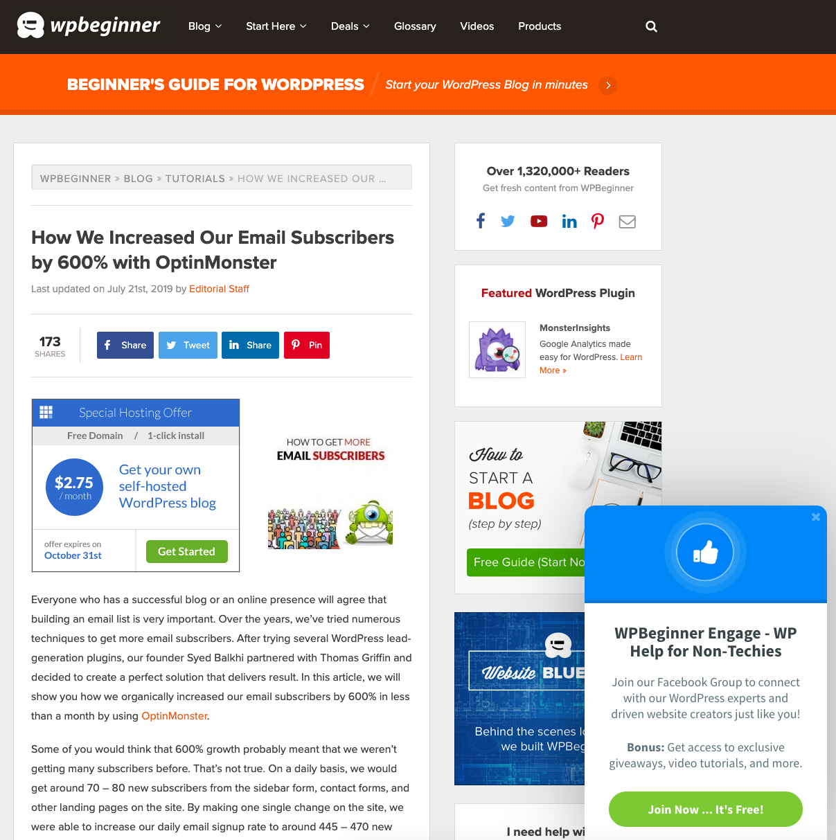
The slide-in squeeze page is my favorite pop-up option. When the user has been on the page for a certain amount of time or scrolled further down, a squeeze page window will slide in offering the deal.
Slide-in squeeze pages don't take over the whole screen, and they're considered far less aggravating (since they usually don't interfere with consuming the content).
Take a look at this example from WPBeginner. You could easily turn the pop-up window into a squeeze page that asks for the visitor's email address in exchange for bonus content.
Entrance pop-ups hit the visitor seconds after they've visited a page. I'm not a huge fan of them (because they're obviously annoying), but they can achieve incredible results.
I'm a bigger supporter of exit-intent pop-ups. These pop-ups trigger when a user moves their cursor off the screen and towards the exit or return buttons. It offers you one last chance to give them a reason to stay.
Again, use this pop-up option with caution. The user might be going back to visit another one of your pages or found the content wasn't relevant to what they were looking for at that moment—it might not be wise to risk alienating them entirely with a pop-up.
Once a visitor has scrolled to the end of the page, consider using an end-of-article squeeze page. They've already consumed the content (and likely enjoyed it since they reached the end), so this is an excellent time to offer them more in exchange for their email address.
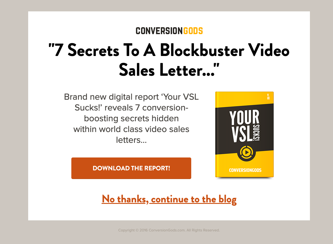
A splash page is another type of squeeze page that's generally used on a site's homepage.
Visitors see your splash page when they try to visit your homepage. The page usually contains an offer and an alternative to continue on to the site.
The splash page is a hit or miss tactic. It could cause visitors to click away before even making it to your homepage—not what you want!
To optimize your splash page, remove all the navigation bars and additional hyperlinks—you want the CTA to be the one-and-only focus.
Like in the example above from Conversion Gods, make sure your "No thanks, continue to the blog" button is large and clear. If visitors aren't interested in your squeeze page, make it oh-so-very easy to bypass it.
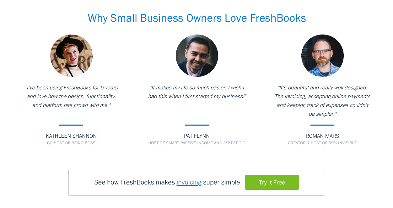
Visitors don't care how awesome you think your product or offer is—they care what their peers think.
A bit of social proof can go a long way in convincing visitors to enter in their email address. Here's how FreshBooks uses customer testimonials to encourage users to sign up.
Research from Nielsen shows that 92% of people trust "recommendations from people [they] know" and 70% trust reviews from strangers online.
To back social proof up further, Edelman's 2019 report shows 63% of customers trust influencers’ opinions of products “much more” than brands' views of themselves. And 58% of people admit they've purchased a product in the past six months because of an influencer’s recommendation.
Try using a bit of social proof with your squeeze pages to boost conversions. It could be a quote, 5-star review, raving Tweet, case study, or a list of company logos that use your brand. Get creative and A/B test variations to see which works best!
Once you get your squeeze page up and running, it's time to dial in the details to drive up your conversion rates.
In one case study, Teespring increased their conversions by a whopping 12.7% by changing the sub-text below their CTA—just the sub-text alone!
Teespring simply changed the text from "This campaign won't be printed unless the goal is reached" to "Don't worry, you won't be charged unless the goal is reached." And bada bing bada boom—conversions rates jumped by almost 13%.
Imagine how much you could boost your conversion rates by just changing a few words of your squeeze page's offer or CTA.
One easy way to amp up your copy is to strategically use power words.
Power words like "Step-by-Step," "Instantly," and "Free" might sound gimmicky, but they pack an irresistible punch.
The opposite of power words are cop-out words—words like "Usually," "Generally," and "Often." Your visitors don't want the tips that usually lead to victory or secrets that are generally successful—they want the easiest, most surefire solution they can trust!
Avoid cop-out words and focus on power words to boost your squeeze page's conversion rates. For a list of top-notch power words, check out Sumo's 401+ Ridiculously Useful Power Words. I love to reference this list whenever I'm writing email subject lines, blog post titles, or CTAs.

Squeeze pages are far from set it and forget it. The only way to fine-tune your pages to squeeeeeeeeeeze the most email addresses is to A/B test.
A/B testing is the process of comparing two versions of a piece of content, while only changing one item in the variation. Again, it only works if you change one item in the variation!
For example, if you were A/B testing your squeeze page, you might change your CTA button from green to red. Or in another example, you might include a power word in the headline.
By changing a single variable, you're able to see exactly what makes your squeeze page better or worse. If you change multiple elements at once, you won't know which one caused the change (or if it was the combination that caused the difference).
Try A/B testing all the elements of your squeeze page: color, copy, CTAs, testimonials, images, etc. It'll take time, but if you continue A/B testing, you'll keep improving conversion rates.

Partner with the email service trusted by developers and marketers for time-savings, scalability, and delivery expertise.